Tracking projects based on Agile Methodology
Index
The following article explains tracking progress in projects managed with Agile methodology.
Unlike tracking the progress in waterfall projects (Gantt), projects based on Agile methodology don’t have a required calendar projection, therefore the way to track progress differs from Waterfall.
In the “Progress” section of an Agile methodology project, you will find the following sections: Progress Report, Tasks by Type, and Charts / Diagrams.
Progress Report
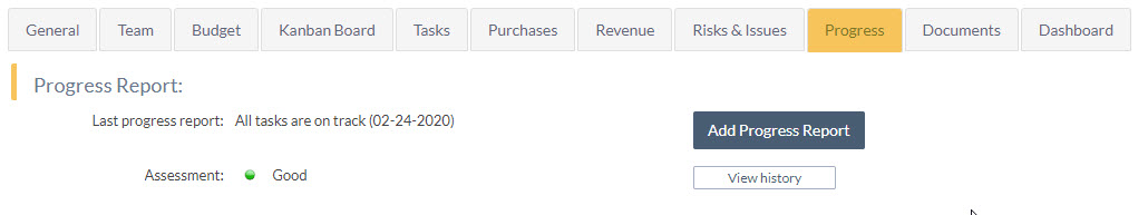
This is useful when the progress of the project is not only represented by the consumption of tasks, but by the achievement of the deliverables of the project.
Task progress report by changing the task column
When you move a task to a completed column, you can configure the system so that its progress is increased to 100%, generating automatic progress report.
To configure this behavior in agile projects, access “Edit board layout”, edit the column of the type “Completed” that you want and tick the checkbox “Automatically update to 100%”
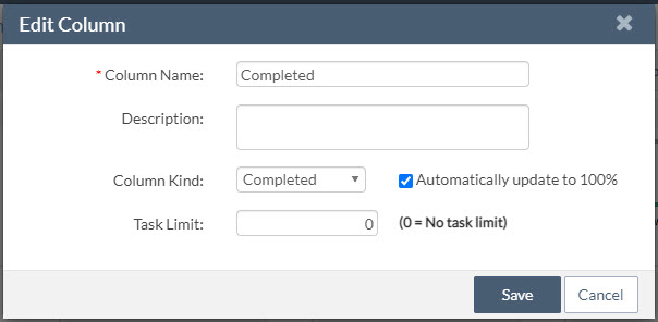
Thereafter, the tasks you mark as completed will be assigned 100% progress.
Note that if you roll back the status to a “Pending” or “In Progress” type, you will need to manually assign the new progress, if desired.
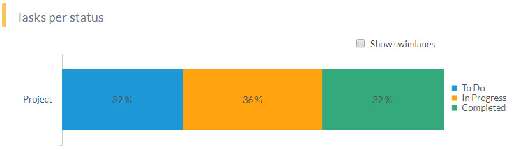
Tasks by type
This chart represents the percentage of tasks in each status present in the project at this time.
The standard status types are “To Do”, “In Progress” and “Completed.” It is independent of the number of columns that the Agile board has because each column will be based on one of these three types.

Tracking Charts/Diagrams
This section provides two options: Burndown chart and Cumulative Flow diagram (CFD).
Both share the same filtering block which allows you to customize the displayed information according to your preferences.
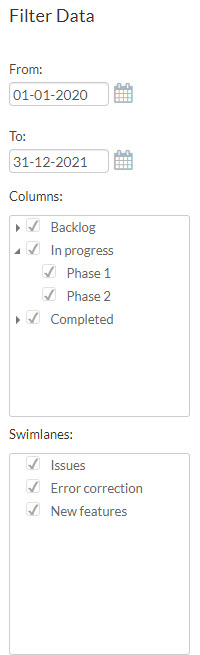
Determine the timeline the chart will represent.
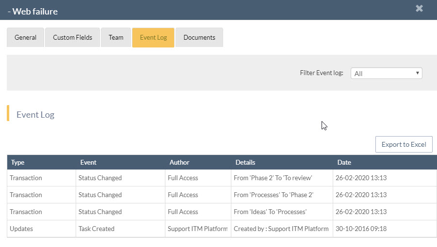
It is important to note that the dates that are reflected in the charts are those of the task status changes. That is, they are not the start or end dates of tasks.
You can view all date and status changes in the “Event Log” section of the task.
- The Cumulative Flow diagram will start on the creation date of the first task and end today.
- In the Burndown chart, the chart corresponds to the start and end dates of the project.
Dates representing verticals (X-axis) are the result of dividing the period by 14, so that regardless of the temporal dimension of the chart, you will always have a homogeneous view. If the duration is less than 14 days, you will notice as many intervals as there are days.
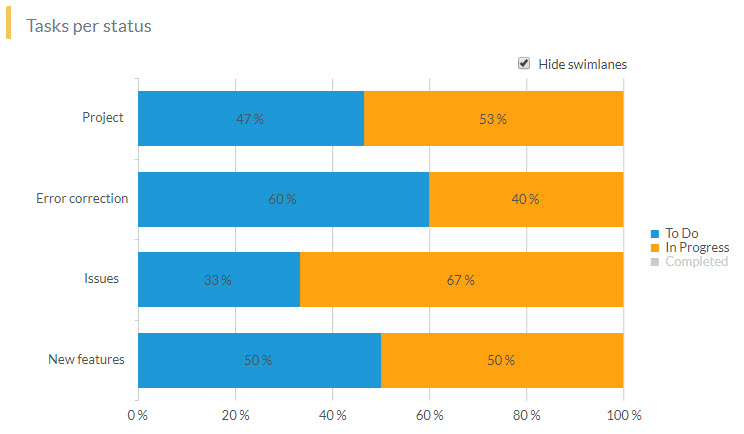
Columns and swimlanes
You can choose to show or hide tasks that belong to:
- Columns: Remember that each column has one of three types and these are the ones that are represented in the charts.
- Swimlanes: either used as process types or sprints.
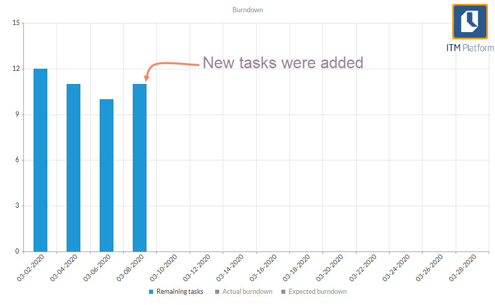
However, if we add “To Do” tasks as the project or sprint continues, we will notice anomalies in the trend because instead of reducing the backlog, it will increase.
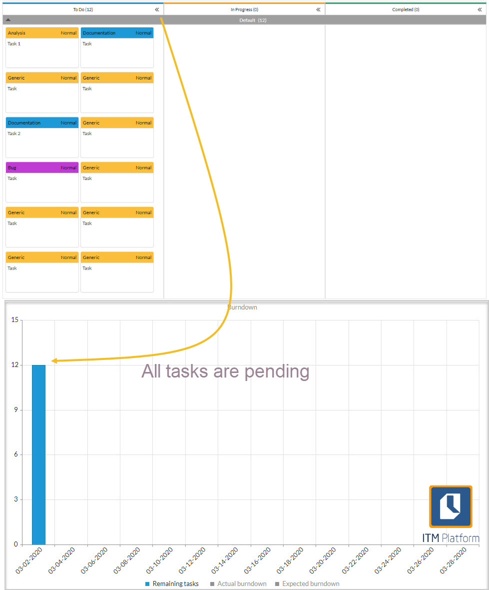
Expected line of progress
This is a straight line that connects the number of tasks in the “To Do” status on the Y-axis to the beginning of the interval on the X-axis at that point in time. At that point in time, there should be no pending (Y-axis =0), so it is steadily declining.
How to interpret: If the tasks are of similar size, the number of pending tasks should be represented by the expected progress line.
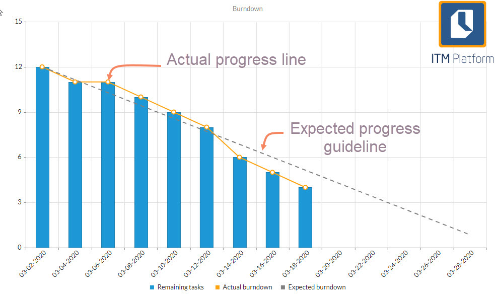
The slope of the progress line indicates the “velocity” and determines the number of tasks completed per time block (usually a sprint).
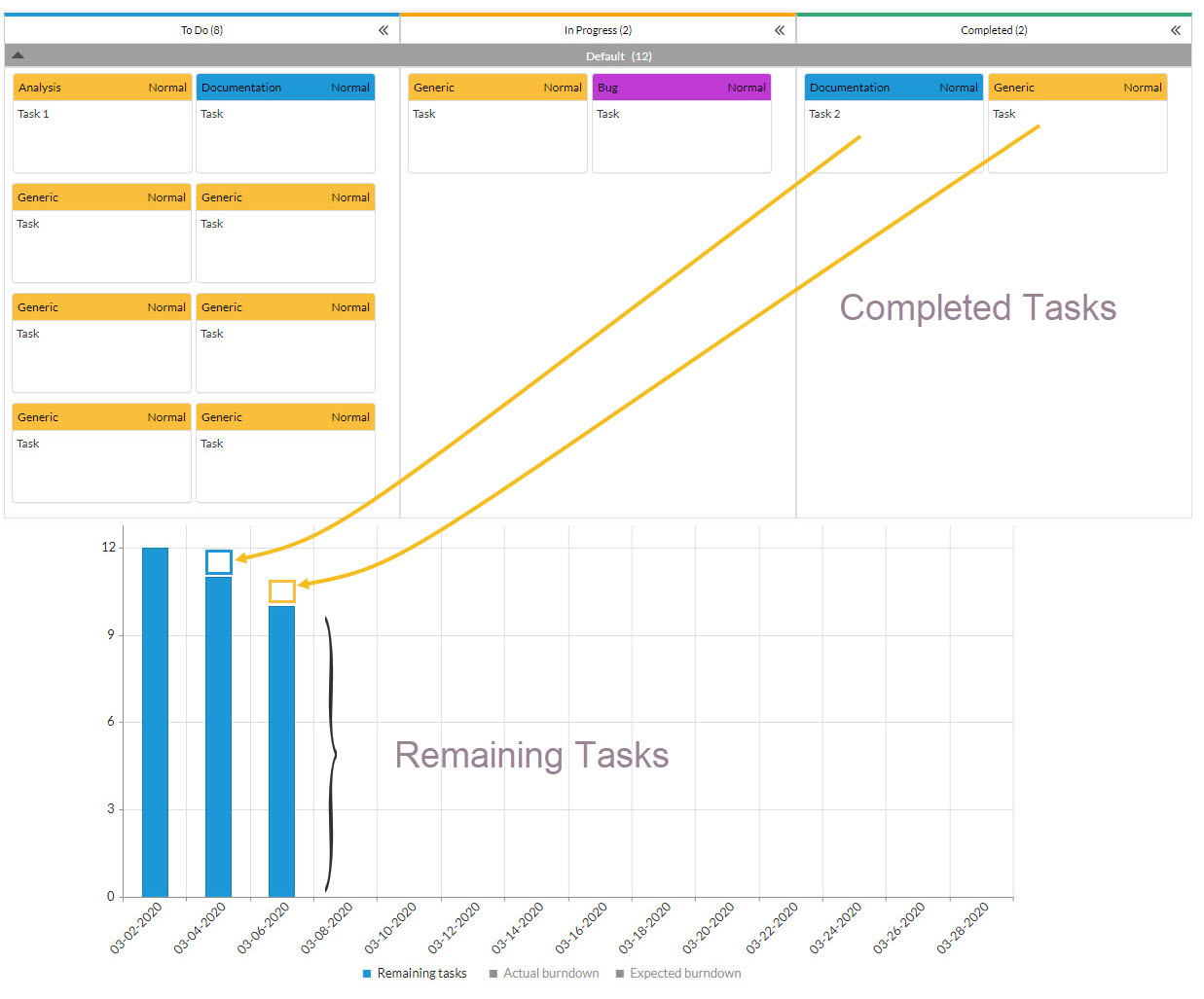
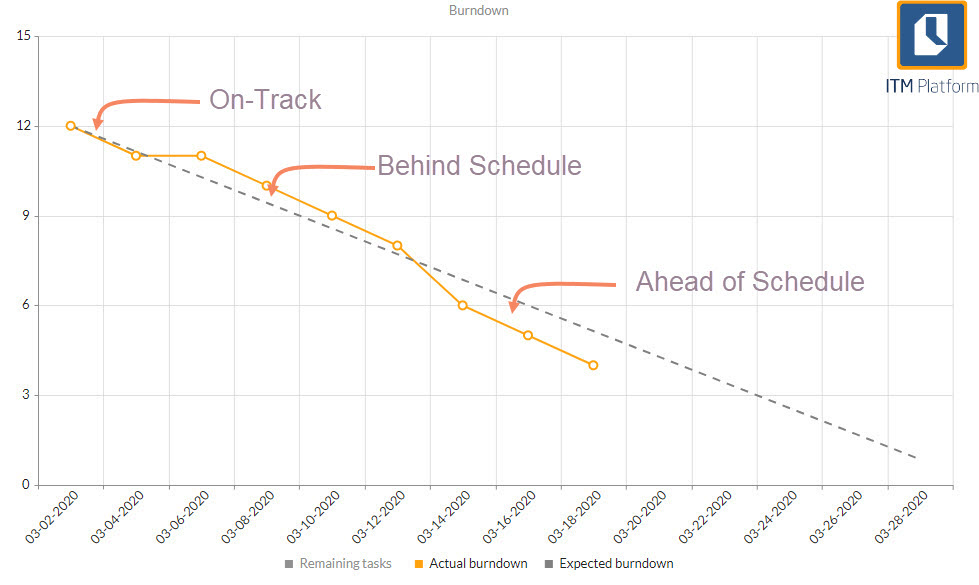
How to interpret a Burndown chart
On-track: The expected and actual line of progress are together. If it keeps this pace, the project will end in time.
Behind schedule: If the actual progress line is above the expected line, it means that the team is delayed and should have completed more work at this point.
Ahead of schedule: If the actual line of progress is below expected, it is progressing at a faster pace than expected. You can finish earlier than expected or add tasks. These interpretations are valid as long as the tasks are the same size, i.e. the time to solve them is similar.
Burndown Diagram Limitations
The Burndown diagram only represents the completed work. It reports the pending work, but it doesn’t reflect what is in progress.
Burndown works best on sprints or short projects and makes less sense with long-term projects. In long-term projects, pending work goes through many changes in order for the estimates to make any sense. This is the biggest reason why Burndown is not recommended for Agile methodology.
The Burndown diagram represents scope changes, as changes in the backlog are not displayed effectively.
These limitations are overcome by the Cumulative Flow Diagram.
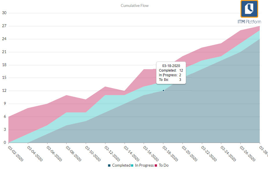
Reading the CFD
As you go along, the diagram shows the task flow by status. It is called “cumulative “because it does not measure increments between intervals but counts each element in each status, regardless of whether it was in that same status previously.
This way, it solves the main Burndown problem, as it represents situations in which to-dos are not all created on the first day.
The CFD provides two fundamental pieces of information in Agile management: Work in Progress (WIP) and Cycle Time (CT).
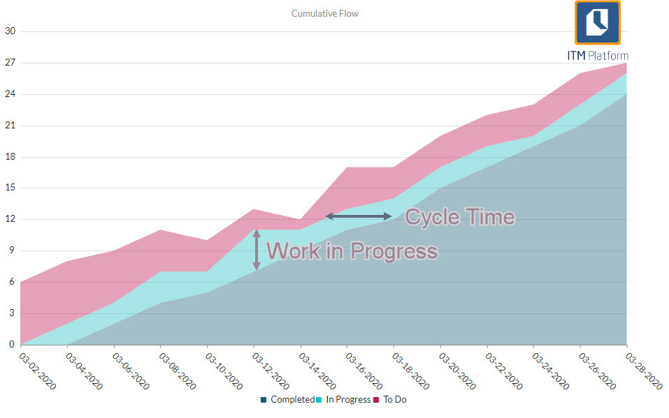
The space between time intervals provides Cycle Time (CT) represents the average time it takes a task to move from one status to another.
Limitations of the Accumulated Flow diagram
Despite solving the main limitations of the Burndown chart, the CFD has its own limitations.
• It does not reflect whether any task is blocked
• Related to the previous one, it does not indicate the individual cycle time, which means the amount of time that a particular task has remained in a single stage.
These limitations can be resolved through reports or custom views of tasks.